
Packaging
Design overview
PACKAGING FLAVOUR COLOURS
The packaging colours have been created to best reflect the dynamism and energy of the brand, its products and range of flavours, whilst also complementing the brand logo.
ORIGINAL
PRIMARY PACK COLOUR
Pantone: 2388 C METALLIC
ORIGINAL
ACCENT PACK COLOUR
Pantone: 280 C OPAQUE
ZERO
PRIMARY PACK COLOUR
Pantone: 298 C METALLIC
ZERO
ACCENT PACK COLOUR
Pantone: 2184 C OPAQUE
CANDY MIX
PRIMARY PACK COLOUR
Pantone: 2346 C METALLIC
CANDY MIX
ACCENT PACK COLOUR
Pantone: 208 C OPAQUE
MOJITO TWIST
PRIMARY PACK COLOUR
Pantone: 7488 C METALLIC
MOJITO TWIST
ACCENT PACK COLOUR
Pantone: 6165 C OPAQUE
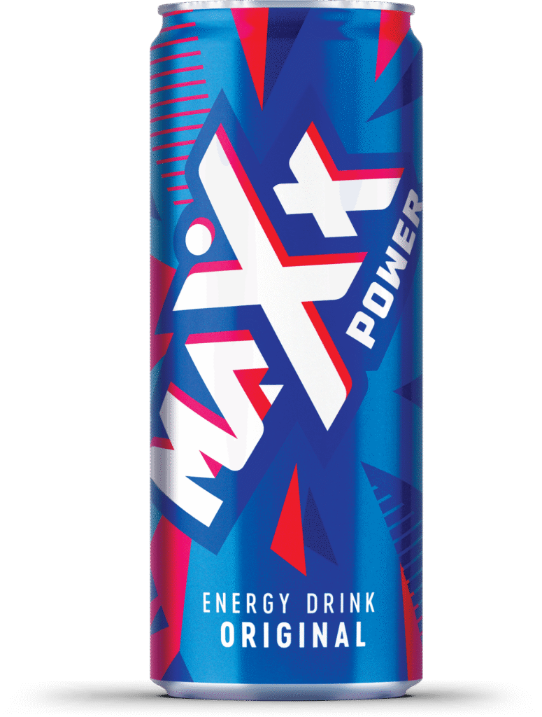
Can


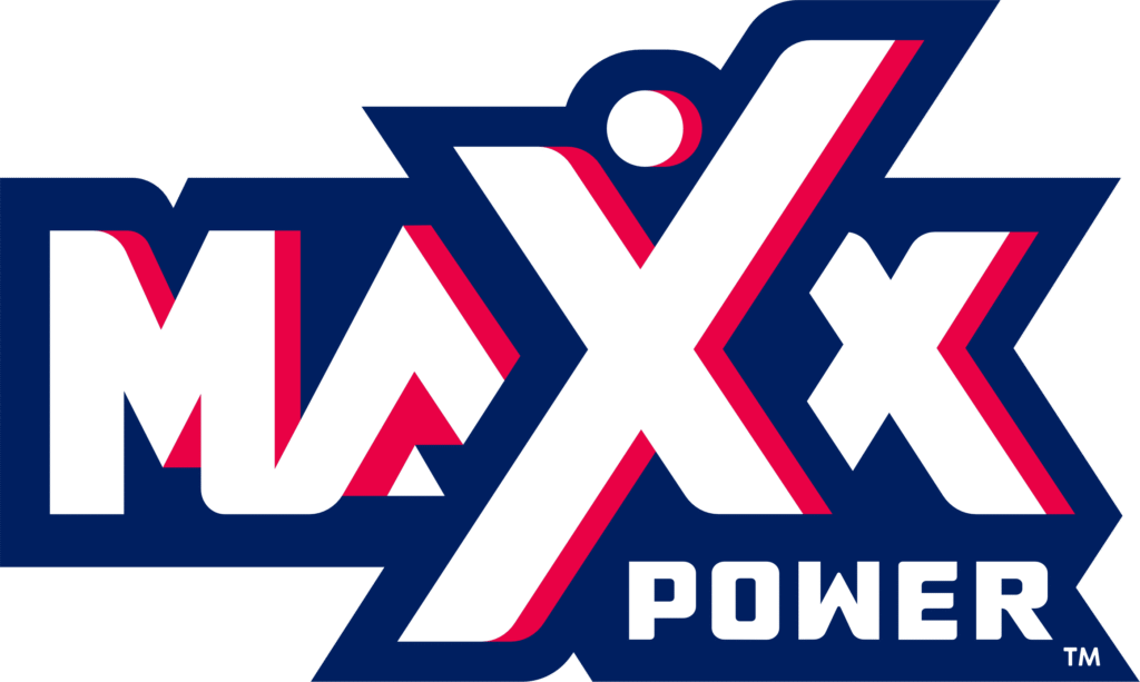
Logo on-pack APPLICATION
On all packaging, the logo is always placed at a consistent 60° angle, allowing it to be maximised for the range of formats and make a strong, dynamic presence.

Logo on-pack APPLICATION
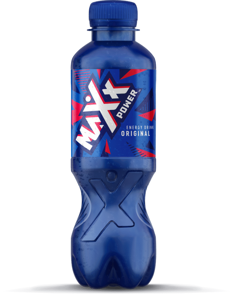
PET


Logo on-pack APPLICATION
On all packaging, the logo is always placed at a consistent 60° angle, allowing it to be maximised for the range of formats and make a strong, dynamic presence.
Back of pack TYPOGRAPHY
For the back of pack typography, three different typefaces are required.
A different font is needed to suit the requirements of the three languages used across the range of packaging.
These fonts have been chosen to reflect the qualities of the brand, and be visually similar to each other for overall consistency.

RUSSIAN LANGUAGE FONT
Myriad Pro
Myriad Pro Semibold
Myriad Pro Black

GEORGIAN LANGUAGE FONT
Aktiv Grotesk Geor
Aktiv Grotesk Geor Semibold
Aktiv Grotesk Geor Black

ARMENIAN LANGUAGE FONT
Aktiv Grotesk Armn
Aktiv Grotesk Armn Semibold
Aktiv Grotesk Armn Black
Closure design options
full colour


two colour


Maxx Power Brand Book © 2025 | Confidential — For Internal Use Only
The Maxx Power Brand Book is too big, bold and unapologetic to exist on a small device. Please fire up your desktop and dive in there!